Starcatchers is Scotland’s National Arts and Early Years Organisation. We want to ensure every baby and young child aged 0-5 can find inspiration through the arts.
Starcatchers was an early adopter of OutNav and has helped Matter of Focus to test and refine the software. We mapped all of our key work areas to outcomes using this approach. We also had support from Sarah Morton to evaluate our Creative Kin Programme. This has helped us get used to using OutNav and start using it to evaluate all of our work.
A key focus of Starcatchers’ work is the professional development of early learning and childcare professionals to offer more art-based approaches in their everyday practice.
Through Creative Skills, we deliver an artist-facilitated training programme across Scotland to help the early learning and childcare workforce feel more confident in using creative approaches within their settings. This includes visual art, music and dance.
Our reports cover each year of delivery for our funders. On top of this, the techniques I outline in this blog helped us create images and graphics which we could use to report to the public via social media.
A rich seam of qualitative data
In order to understand whether and how this programme makes a difference to the people who take part, and ultimately the young children they work with, we gather a variety of evidence. The evidence we gather from the participants of our training comes in several different forms:
- An application form to help understand individual needs and aspirations.
- A baseline survey, completed on the first day of the project to assess levels of confidence in specific art-forms, understanding of creativity in Early Years, how regularly they use creativity and how creative they feel as an individual.
- An evaluation survey, completed at the end of the project – finding out about experiences of the programme and revisiting the baseline assessment.
- Case studies directly from participants who completed the training in 2018/19, which include how they have used the training in practice and what difference it makes.
- Impact stories directly from participants who have used the training over a longer period of time to understand how and whether there is lasting change.
In short, most of our data is qualitative, text-based feedback, which, unless we make it more visual, can lead to a report that’s mostly dense paragraphs.
A picture paints our participants’ words
As humans, we find a lot of text with no images hard to process. According to research conducted by John Medina (developmental molecular biologist and research consultant) if you hear a piece of information, three days later you will remember roughly 10% of it. If you add an image this percentage becomes 65%. On top of this, we also process images much more quickly, meaning reports that are more visual are easier to read and take less time to understand.
With this in mind, I thought I would take advantage of OutNav’s upload graphics function, go back to the data itself and see what could be expressed as an image instead of text within analysis of our progress.
The starting point was using a survey software (we use Survey Monkey, but there are other options available – for example, see Feedback matters: choosing the right survey tool). Our survey software can count how often particular words are being used in feedback. With this information, I used our most commonly used words to make a word cloud.
Word clouds transform text into visual representations by taking into account how often words are used – the more a word is used the larger it becomes.
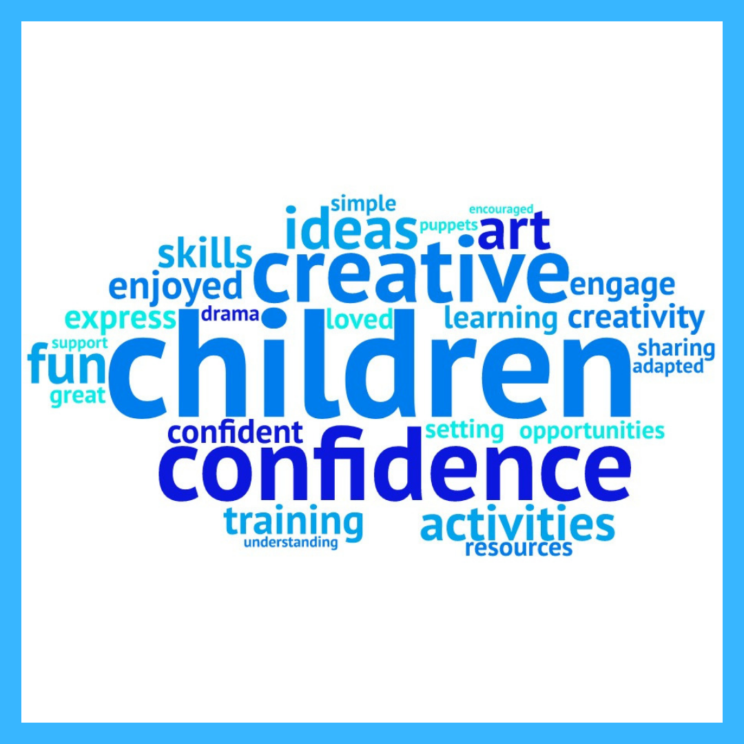
When we apply this technique to our participant feedback it directly shows the exact words they use and what people are mentioning the most (for us, “children”, “confidence”, “creative”). It’s an excellent way of visually demonstrating what matters most to the people from our project.
Standout quotes
I also went through our feedback and turned quotes from participants into graphics. For this I used the website Canva – a free online design software. It was as simple as selecting “Instagram post” as a layout and searching their templates for “quotes”. All I did after that was type in my quotes to the template and play around with the colours. Without much work I had a bank of quotes saved as images online.
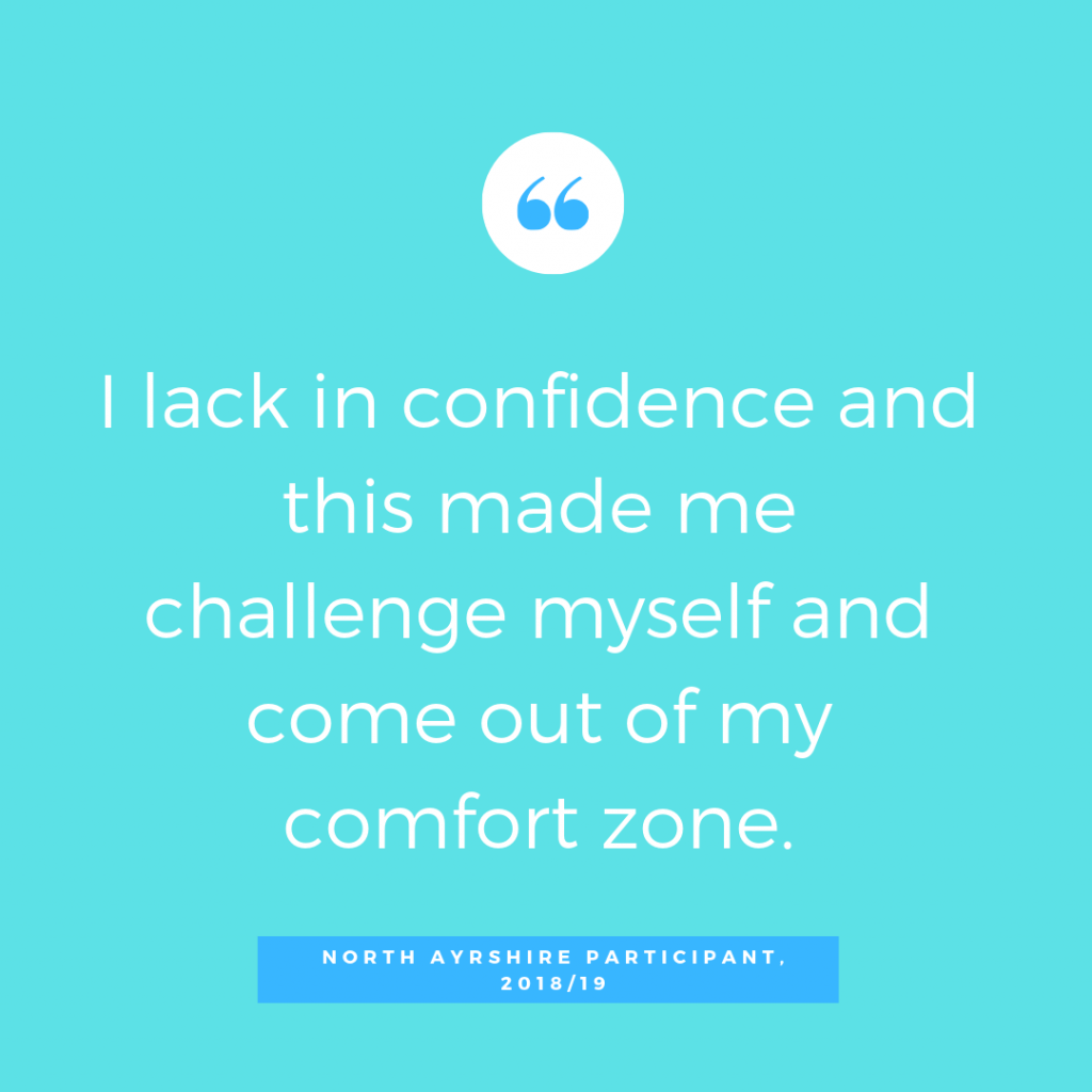
With Canva you can also add shapes, graphics and upload your own photographs. If you’re a charity it’s possible to get the premium version of Canva for free through their “Not for Profit” Programme (although a lot is still possible on the free version!). One of the useful things about Canva is you can copy and paste a page so, instead of starting from scratch, once you have your layout, you can duplicate and simply edit the text.
Focusing on what matters
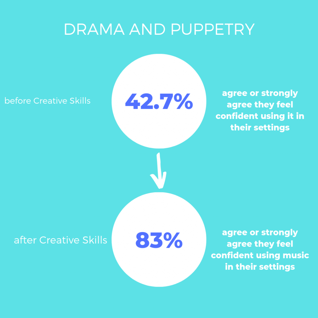
I also used Canva to create visual displays our statistics. We gather data on how confident participants feel in specific art-forms, which our survey software displays as a graph. The core data I wanted to show was the percentage of participants who claimed to feel confident and the change before and after the programme. Once I had narrowed it down, I could edit graphics which just showed those two numbers – making it easier to see the change and read quickly.
Keeping it real
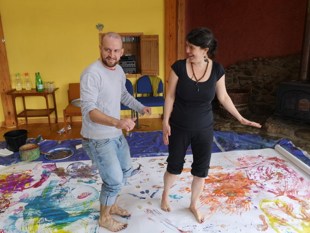
Lastly, I filled our reports with photographs alongside our quotes. Nothing makes a project feel more real than actually seeing evidence of the people we worked with. With OutNav, a big section is evidencing how people feel and we felt pictures of people having fun said a lot more than statistics.
Questions to ask yourself about your data:
- Who are you gathering data from and how can you capture their voice in your report? How do they speak? What are they saying?
- Where do you get your data from? Where do you store it? Do you know how to access it easily and efficiently?
- How will you display it? How can you best communicate your point in a straightforward and relatable way? Do you need to show as much information, or can it be simplified?
The advantages of this method of thinking not only helped us create reports, which were easy to understand and highlighted the voice of our participants, it also made us rethink how we gathered data in the first place. By moving towards quotes and photographs, we made sure to take notes at sessions (and take cameras!) For me this was an incredibly valuable experience – I had conversations with participants I wouldn’t normally have if they only ever “met” me through the phone or an email.
Data, then, does not end with numbers and percentages written in long paragraphs of text. It can be found in conversations and connections which, in turn, can be shown in pictures, photographs and graphics. As a participant of Creative Skills said…
It goes beyond being given a set of instructions to follow, it’s a new way of thinking about your practice. We have to be more creative about being creative”.
Image credits:
Catherine’s profile photo was taken by Yola Sornsakrin
All illustrations are by Catherine Wilson, Starcatchers
Photo of creative skills training in action by Fraser Stone, Starcatchers