This is the fifth of six key pillar posts that will take you through our approach. We recommend reading each of these posts and following the links we’ve made to other useful tips and tricks. If you’re working on evaluation and outcome-monitoring, you might like to come back to these posts as and when you need support. We’re here to help! So please do get in touch if we can help you embed an outcome-focused approach to your work.
- An overview of the Matter of Focus approach
- Understand the outcomes and impacts that matter
- Understand the unique context of your work
- Get the data and evidence you need to track your progress
- Track and visualise the difference you make (you are here)
- Report in an outcome-focused way
An outcome or impact map forms the basis from which you can track and visualise your progress towards outcomes. It does this by allowing you to drill into the different levels of outcomes, collect and collate evidence, and analyse it to show your progress. If you’re reading these key pillar posts in series, in the previous post you’ll have read about how we believe in pulling together the evidence you need. This post helps you to analyse that evidence and understand how your work is going.
Using an outcome or impact map to track progress
We look at different levels of outcomes in our approach. We connect these outcomes to the work you do and the engagement and reach you have with people and communities. In this way we help you show how you make a difference as well as the specific kinds of outcomes and impacts which occur.
Under each level in your map you can bring together the relevant data – drawing on the evidence, feedback and research you have collected and collated – and use it to show your progress. Our approach works just as well with qualitative or quantitative evidence.
Some initiatives will have measures that are embedded in funding, or important to delivery. We consider these alongside other ‘success criteria’. What questions do you need to ask of your data, and how will you judge success? This might range from specific measures for some outcomes to more descriptive success criteria for others.
Sensemaking from your data
Bringing data together and thinking about what it is telling you is a process of data analysis. While this sounds technical, there are tried and tested ways of making this doable and robust.
What is analysis?
Analysis is:
- making sense of data – often from multiple sources
- understanding and explaining what you think the data is showing
- going beyond description – requiring interpretation
- thinking about the different levels of outcomes in a map and how data relates to them.
There are some tips to bear in mind when tracking your progress and looking at data. In our experience, it’s easiest to work with your data and analysis in stages, so you can build learning in as you go.
Tips for data analysis
- Be open to a range of meanings.
- Focus on what the data is telling you, not what you already think or believe.
- Take account of any risks and assumptions attached to the project, and the wider contextual factors that might have shaped it.
- Reflect on the quality of the data you are looking at.
- Look for themes, concepts, phrases and keywords.
- Include reflective questions in the process:
- What factors shaped data captured on this occasion?
- How do accounts of key people fit with observations?
- What conclusions can be reliably drawn?
- Which bits of data should be treated with caution?
Keep in mind that you can use these principles and points for any kind of data – qualitative or quantitative, as we discussed in our post Get the data and evidence you need to track your progress.
It can be helpful to start with tentative analysis and build it up as your data improves. The tips we’ve offered here work best when focusing on one outcome at a time. We find that often people lack confidence in data analysis when they start, but as they write and reflect the story starts to build up in a satisfying way.
Visualise your progress and confidence in your data
Once you have started the ongoing process of analysing data for each step in your outcome map, you can look at your evidence, judge the quality of it, and assess your progress.
In OutNav, your data and evidence files are linked to each step of your outcome map, so everything is easy to find when it comes to judging your progress towards outcomes. Find out more about how OutNav streamlines your data and evidence.
We have built two criteria into our approach to help people understand their data and progress:
- An assessment of what the data is telling you about your progress towards outcomes.
- An assessment of your confidence in the strength of your data.
When you make these two assessments in OutNav you will see progress at a glance thanks to its outcome map colour coding system. This means you can instantly see where progress is better or worse, and where evidence is stronger or weaker.
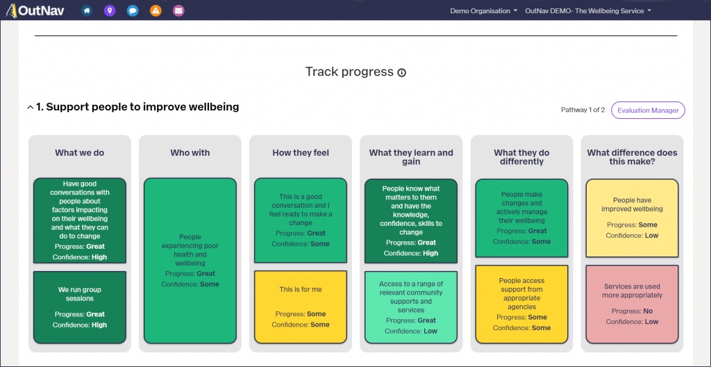
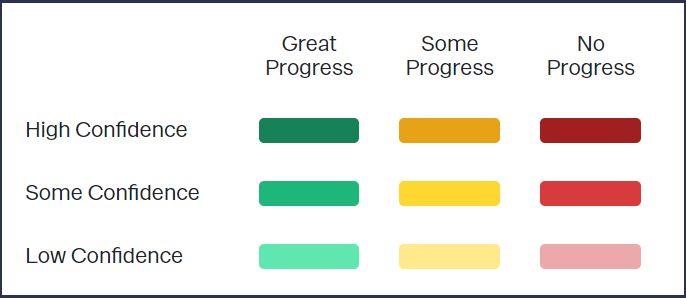
The traffic-light colour represents your assessment of progress and the depth of colour represents your confidence in the evidence.
A system for planning, learning and evidencing the difference you make
Prior to developing OutNav, we found that many people loved working with outcome maps, but there really wasn’t an appropriate system to allow them to drill down into their data and assess progress.
We used to hand over a copy of the agreed outcome map along with an evaluation plan and a Excel spreadsheet, but it was clear that people found it hard to keep on top of their tracking.
In developing OutNav, we brought to life our vision for a friendly and usable system to really enable teams and organisations to tell their story and embed meaningful evaluation and outcome working into their practice.
OutNav structures the process of data analysis described here and creates manageable chunks or units of analysis to give people the tools they need for this process. Read more about how to track your progress and impact in OutNav
Breaking analysis down into manageable chunks is hugely beneficial if you’re doing evaluation alongside your day job, as unlike more traditional approaches to analysis, progress can be made in short sharp bursts.
We believe in everyday sensemaking!
Effective use of data, feedback, evidence, and research should be an everyday activity for people working in public service settings. We think it can really improve the efficiency and effectiveness of projects, programmes and organisations.
Mapping and tracking and reporting in OutNav means this information can be meaningfully pulled together to learn and improve, understand change, and to tell the story of the difference you make in the world.
In the next and final key post taking a look at our approach, we focus on why and how to report in an outcome-focused way.