This post looks at the process of ‘tracking’ in OutNav – the steps you take to analyse what your data and evidence is telling you and rate your progress and confidence in your evidence.
This is the fourth of six key posts that walk you through the main features of our OutNav software.
- Outcome maps – the cornerstone of OutNav
- OutNav supports team and partnership working
- OutNav streamlines your data and evidence
- Track your progress and impact in OutNav (you are here)
- Create visual contribution reports in OutNav
- Ongoing learning and support with the OutNav Community
You’re ready to start tracking your progress towards outcomes
By this stage you will have created your outcome map(s) in OutNav, carried out an audit of your data, considered what you need to collect against each stepping stone in your map, and started to upload your data and evidence. Now, it’s time to use OutNav’s tracking functionality to track and visualise your progress across an outcome area.

For the background on this aspect of our approach, read Track and visualise the difference you make.
OutNav takes you through a process of structured analysis of your data
Each stepping stone in the pathways you have plotted through your map is a place to consider the relevant data you’re collecting.
When you move into the ‘tracking’ section of OutNav, your pathway outcome maps will become white (shown below). Gradually, as you start making an assessment of the quality of your evidence and your progress, your outcome maps will become alive with colour – as you will see shortly.
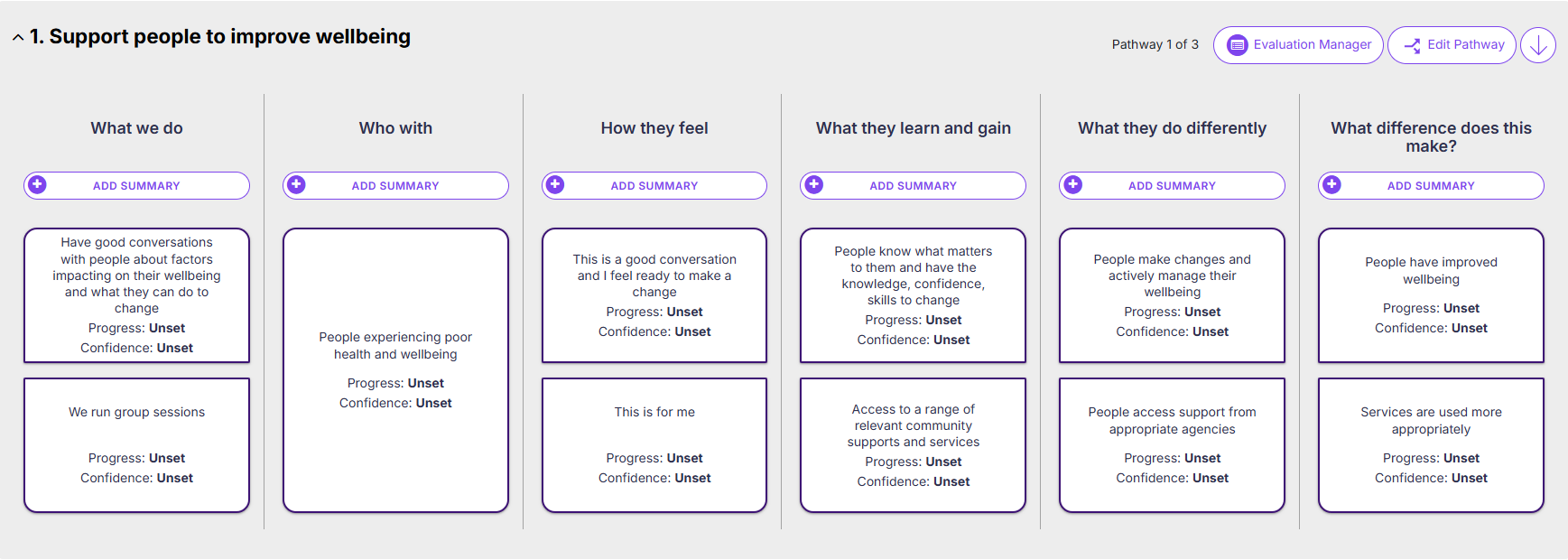
To start tracking your progress, click on a stepping stone to open its Update Analysis screen (shown below).
Here you can reflect on and analyse what your data is telling you about your progress at this level. You make a qualitative assessment and write about it in the analysis summary field.
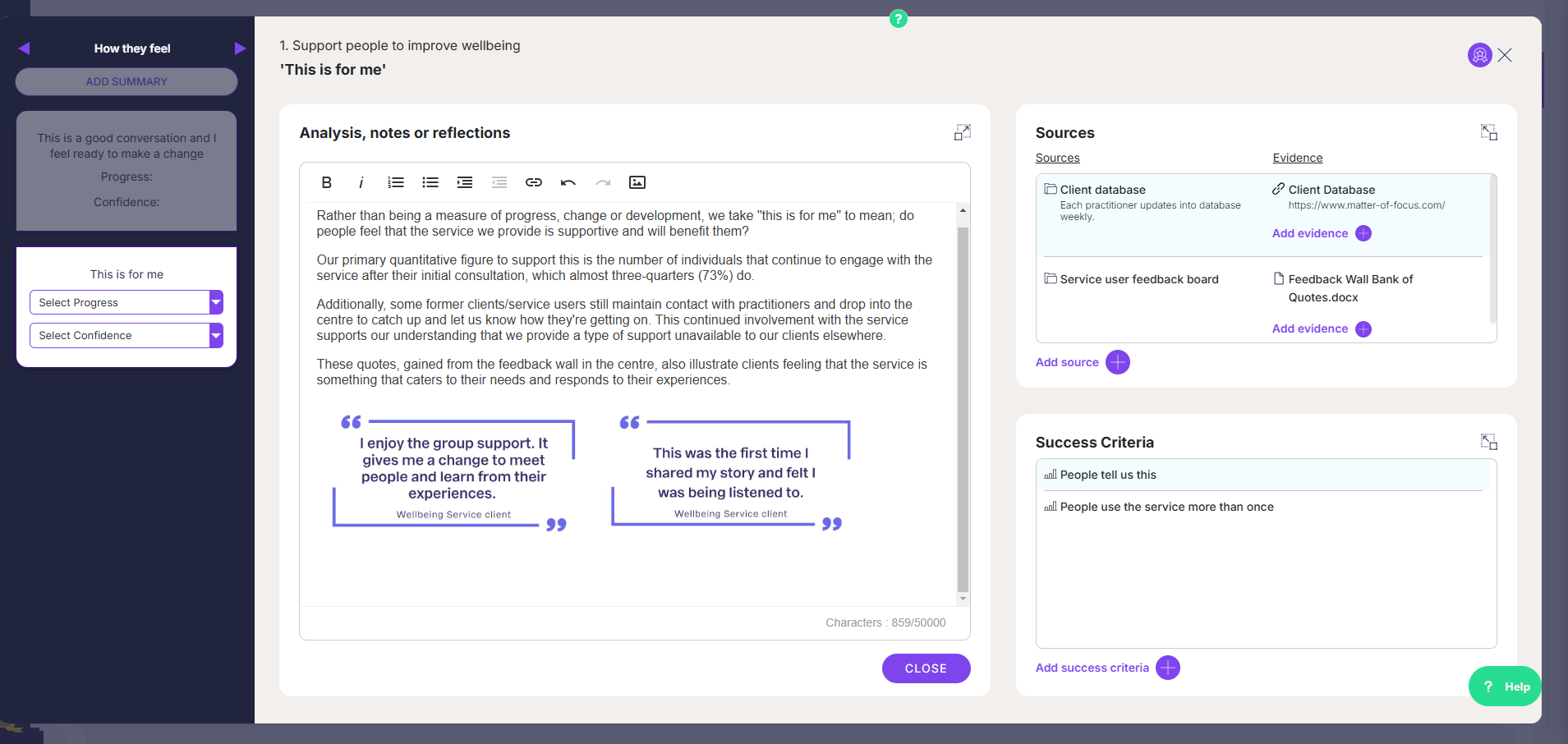
This summary of analysis field has familiar formatting tools and the functionality to upload graphics and images to help you illustrate your analysis. Should you want it, the analysis you write here will be pulled into your OutNav reports, and you want these to be visually engaging. Our next key pillar post takes a closer look at this.
Quickly visualise your progress
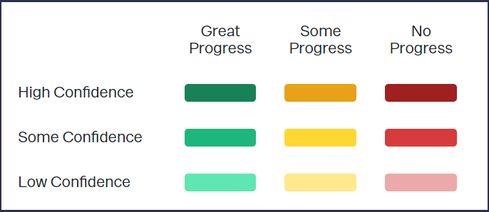
Having written or updated your summary of analysis for a particular stepping stone, you can rate whether you are progressing well at this level and also rate your confidence in how robust your evidence is.
The result of this two-factor rating system is a colou-coded stepping stone, and ultimately a colour-coded map.
The colour of a stepping stone shows your progress at that level, and the depth of colour shows your confidence in the evidence.
The OutNav colour coding key
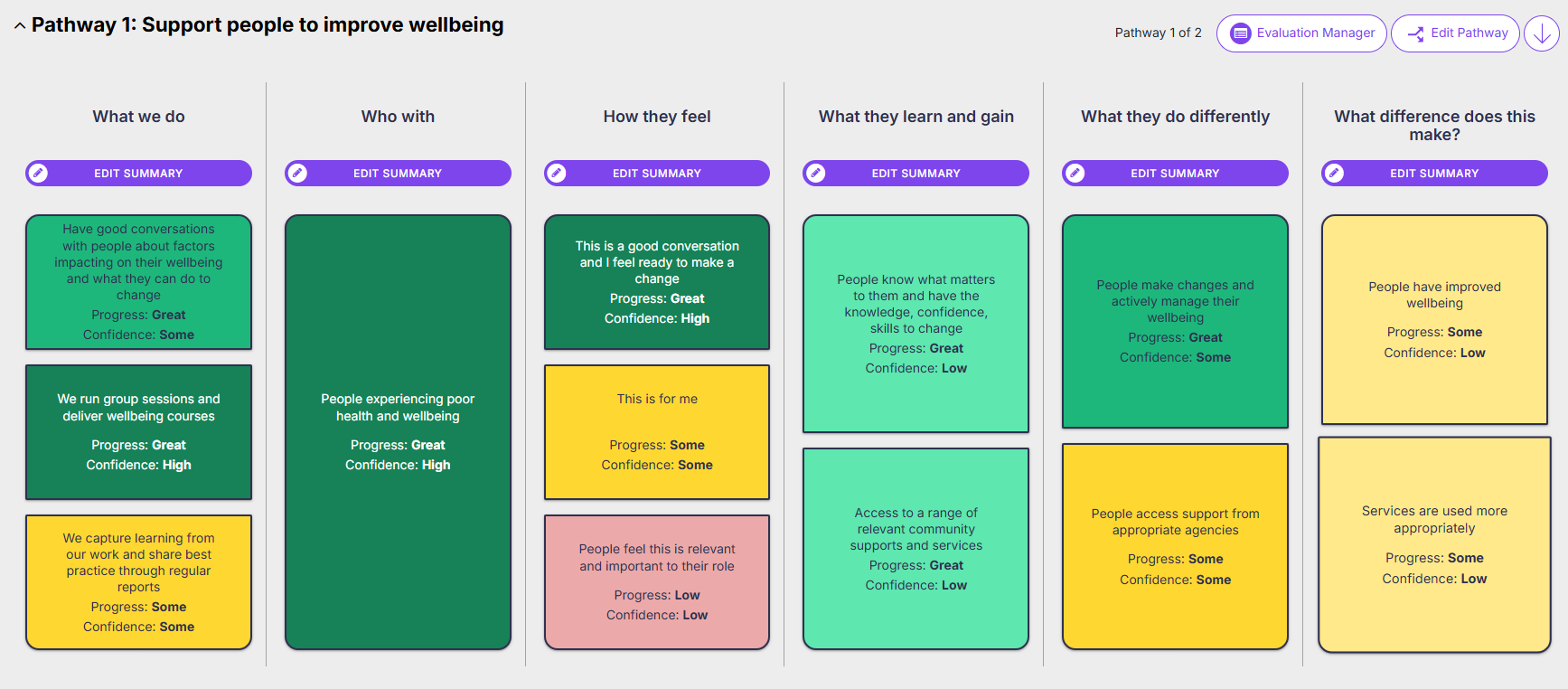
Your colour-coded outcome maps provide a quick way of visualising how projects are doing. You can see your progress across an outcome area and how strong your evidence is. The colour-coding can also provide a quick overview of whether there are any gaps in your data collection.
If you’re using OutNav’s cloning function you can quickly see the relative progress of the related projects that are all using the same approach. It will be easier to understand what’s going on – what’s working well or not across all projects, or what differences are emerging.
When we come together to collectively rate our progress, we find that we’re less hard on ourselves and we can see that we’re making good progress. Being able to visualise progress in OutNav validates the work we do and helps us to plan ahead and improve our work.
Melvina Robbin, Future Pathways
Add high level summaries to your analysis
As well as carrying out analysis on your individual stepping stones, you can add an overall summary to each column of your outcome map.
When creating a report, you can include this summary analysis in place of, or in addition to, the more detailed analysis of individual stepping stones. View a demo summary report here.
To add a step summary, click on the button at the top of the corresponding column in the ‘tracking’ section of OutNav. This will take you to the Step Summary screen (seen below).
The Step Summary screen shows you a list of all the stepping stones within this column. Click on the title of a stepping stone to display any analysis you have entered within it. You can use this as a reference to write a summary in the text box below, or even copy and paste sections of text from one to the other.
A flexible system – adapt and learn as you go
You will likely start with a rating of no progress in some places in your outcome map, especially if this is the first time you have scrutinised processes.
OutNav has been built to support our approach, which is flexible and allows for redirection and innovation if things don’t go as planned. You can change and adapt your outcome maps as you learn about what is working well and what isn’t. They are not intended to be set in stone and used as a way to judge performance.
Sharing your colour-coded outcome maps can help tell your contribution story. Find out more in our next key feature post: Create visual contribution reports in OutNav
If you would like to arrange a demo of OutNav, we would be happy to schedule some time to show you around and discuss how we can help. Or you can join one of our regular scheduled live OutNav demos.
Find out about our OutNav Demos